How to Read Stock Charts
Stock chart types
What types of charts are available? For studying the markets by reading stock charts, here are the four main chart types used:
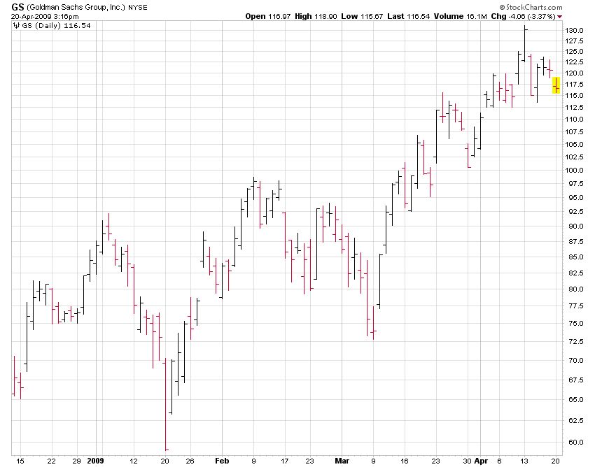
1. Bar charts (HLC / OHLC) – This is the most widely used chart and the default used throughout the site here on StockTrader.com. It is constructed to show four pieces of information: opening price (optional), closing price, high of the day, and low of the day. Looking at each day’s history, a vertical line shows the day’s trading range with a horizontal line pointing left to mark the opening price and a horizontal line pointing right to mark the closing price.

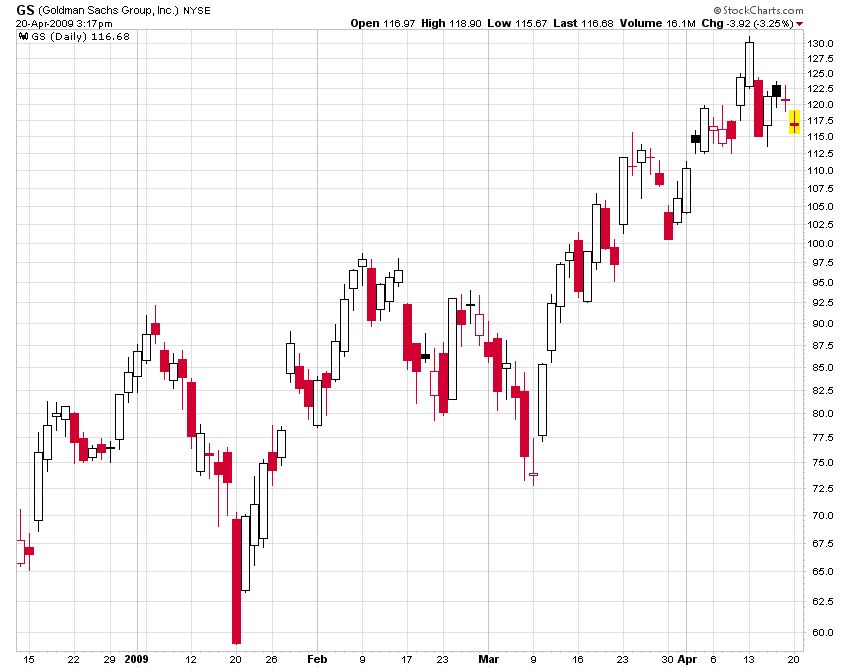
2. Candlestick charts – This chart presents the same data as a bar chart, but in a slightly different format. The chart has two main parts. The first is the thin line, known as the “shadow,” which shows the price range from high to low. The wider area, known as the “real body,” measures the difference between the opening price and the closing price. If the close is higher than the open, the real body is white.

3. Line charts – A line chart measures only the closing price and connects each day’s close into a line. Many technicians believe closing price is the only point that matters. For them, a line chart may be the most appropriate study.

4. Point and figure charts – A point and figure chart is concerned only with price, not time or volume. The chart uses an "X" to mark increases in price and an "O" to mark lower prices. With this approach, it is easier to spot trends and reversals. However, since time is not used as an input, P&F charts offer little guidance on timing, e.g. how long it will take for profit objectives to be met.

Each chart type for performing technical analysis has its benefits. By exploring the options each approach provides, investors can determine which type best meets their needs for reading stock charts.

Stock chart components
Below I have taken a stock chart of the NASDAQ Composite and labeled the main parts. Below the chart I will explain these parts and what they mean when it comes to reading a stock chart.

- Chart identification - Every chart is labeled and tells you what exactly you are looking at. So, if we look to the left of one we can see very clearly that we are looking at a chart of $COMPQ (Nasdaq Composite) INDX. The $COMPQ is the ticker symbol of the index. Just like Google has a ticker of GOOG, and Microsoft has a ticker of MSFT.
- Summary key - The first number displays 2303.54 which is the last price of the index. To left of this number it says "(daily)", which means we are looking at a DAILY chart of the index. You can view charts on weekly and even monthly views. Below this we can see the blue and red lines (50 and 200) MAs. These are the price moving averages which I will explain more in point #4. Bottom line is that the summary key tells us the important numbers from the stock chart we are viewing.
- Time period - The X axis always displays the time period. If you view the dates left to right you will find that we are viewing a chart of the months of April, May, June, and July.
- Moving averages - Moving averages are a form of technical analysis that help identify support and resistance on a stock chart. On this chart the red line is the 200 day moving average, and the blue is the 50 day moving average.
- Volume - Volume is extremely important as it helps determine market momentum. Each bar represents one day, and the red line going through the tops is the average volume over the last xx days (in this case 60). So, the taller the volume bar, the more shares of stock that were traded that day.
- Daily trade range - Just like volume, each red or black vertical line on the chart represents one independent trading day. If the bar is red, that means the stock or in this case the index was DOWN overall on the day compared to the previous day. Black bars mean that the stock was even or UP on the day compared to the previous day.

Volume
Volume is one of the most basic and beneficial concepts to understand when trading stocks. Volume is defined as, "the number of shares (or contracts) traded during a given period of time." This means each time a person sells or buys shares of a stock, that is considered volume.
Tallying volume is done by the market exchanges and reported via every major financial website. To hand tally volume, simply add the shares traded for each order on the fly (you can see orders real-time with any streaming last sale tool). For example:
- Trader 1 Buys 100 shares of stock
- Trader 2 Buy 500 shares of stock
- Trader 3 Sells 1000 shares of stock
Total volume is then 1,600 shares for this sequence. Again, volume increases regardless if it is a buy or sell order.
It is not uncommon for stocks to trade millions of shares per day. For example, the S&P 500 ETF (SPY) trades on average around 75 million shares per market session. This is literally Billions of dollars worth of stock changing hands every day the market is open. On the other hand, smaller company stocks, known as penny stocks, might trade only a few thousand shares in a given day.
Benefits of tracking volume
By understanding what volume is and how it is tracked, we can use this knowledge to help us make better informed trading decisions. There are two key benefits to tracking volume:
- Support and resistance - Throw one pebble at a glass window and it may not crack or break, but throw 100 of different sizes and the chances of a break are far greater. Applying this to stocks, if one investor places an order to buy 100 shares of stock at the current Ask price, the stock may not move up. But, if 20 investors all place buy orders of different quantities, the stock is most likely going to move up in price because there are not enough sellers. Bottom line, to break through a key support or resistance level on a stock chart, volume is needed in quantity.
- Average daily volume - By knowing the total volume on a day, you can understand the power of influence on a given stock. The greater the volume, the more significant and overall meaningful the day was. High volume days are most often observed on earnings days or when news is released. Plotting the average daily volume also allows us to identify accumulation and distribution days on a stock chart, which can be used to identify current momentum and predict future price movements.
Learning to identify volume trends and count accumulation or distribution day strings on a stock chart does take practice. But, when applied correctly it is can give the investor a huge advantage in obtaining profits. Let's take a look at both.

Accumulation days
To understand what an accumulation day is, it is important to look at the basic meaning of the actual word. Accumulation is based off of, "accumulate", which means to, "gather together or acquire an increasing number or quantity of". You accumulate a lot of things in life: wealth, strength, friends, etc. In the stock market, accumulation is used to describe the accumulation of shares by traders. The more people that buy, the more shares that are then purchased, which means more shares are accumulated. Make sense?
Things get easier when you add the word "day" into the picture. It is exactly as it sounds: an accumulation day is when the stock closes (finishes the day) higher on volume (or the amount of shares traded) that is also greater than the day prior. So, if stock XYZ closed yesterday at $13.50 a share with a total of 100,000 shares traded, and today closes as $14 a share with 300,000 shares traded, then we can say it was an accumulation day overall.
Accumulation days are very positive events, because they signal underlying strength due to the fact that institutions are accumulating shares and pushing the stock price higher. The more buying investors do, the more accumulating that is going on, and thus more a stock price will rise.
One final important concept to understand when identifying accumulation days on a stock chart is to look for days where volume was above the 60-day average. Low volume days have little meaning, because it means few institutions were involved. Personally, I ignore them. Here's a recent stock chart of Microsoft (MSFT) to help us out.


Distribution days
Distribution days are the opposite of accumulation days, and are thus considered bearish. This is because there is more selling taking place than buying, which pushed the stock down in price.
For a day to be considered a distribution day, the stock not only has to end down (net $ change), but there also has to be more volume (total shares traded) than the day before. Remember too that, like accumulation days, the volume not only needs to be greater than the day prior, but also greater than the 60-day average.
In summary, when you think of distribution days, think of the word "distribute", or selling, or heck, the color red. With a distribution day, there is simply more net sellers than buyers. Here's examples using the same chart of Microsoft (MSFT).

Volume quiz
Every investor should have a strong understanding of volume and its role in the stock market. Every stock gives key buy and sell signals which can be found by simply knowing how to interpret volume on stock charts. This quiz will test the basics.
1. Volume is simply the number of _______ traded in a given day.
2. In a Accumulation day, a stock closes the day _______ (up or down), whereas in a Distribution day, a stock ends the day ________ (up or down).
3. Interpreting volume is a form of fundamental or technical analysis?
4. To be considered an accumulation or distribution day, one requirement is that volume must be greater than _______?
5. Stock ABC on Monday traded a total of 150,000 shares and finished the day up. Then, on Tuesday, the stock traded a total of 180,000 shares and finished the day down. The 60 day average daily volume is 200,000 shares. What is Tuesday considered?
- A. Accumulation day
- B. Distribution day
- E. Neither
Answers:
- shares
- up; down
- technical analysis
- the day prior
- neither because the stock traded less shares than the day prior

-
What are meme stocks
2 years ago
-
download stock trading for beginners
3 years ago
-
Who Invented the Stock Market?
4 years ago
-
Stock Trading Terms Every Trader Needs to Know
4 years ago
-
WORLD’S GREATEST STOCK TRADER by by Richard Smitten
4 years ago