Support and resistance
Support and Resistance is a basic form of technical analysis that can be used as a way to predict stock price movement and help traders mark potential buy and sell points.
Let's take a look at a clean support and resistance example below.

- The three "1"s show us how CVD stock found resistance at $88 three times before finally breaking through. Participating in the break would have yielded an actual return of 10% in only seven days.
- The four "2"s show distinctly how $80 was a key support level for CVD. The stock held up at this price area several times over the course of five months before it finally broke to the upside above $88 a share.
- The purple "3" shows us where the next resistance area currently is for CVD. Only time will tell if the stock will need another five month base to claim higher highs.
To help drive the concept home, here's another example of basic support and resistance.

- A first glimpse into the resistance ENER saw around $35 a share. As we can see once the original high was made it took two more pushes to break through, which lead to a large stock price gap and new highs for the stock.
- Another example of ENER at technical resistance. This time it was at $73 a share and the third push was the one to claim higher highs.
- Here we see the support ENER has received while forming its latest base. This would also be called a support trendline. A common trend is for resistance to turn into support, which we can see with the first “3” on the left. The $60 resistance once broken then became support.
- Highlighted in purple shows us the next area the stock will most likely find resistance. Climbing above $83 a share would not represent higher highs but also new 52-week and all-time price highs.
When prices are falling, support represents the moment when buying overwhelms selling and prices reverse. Conversely, when stocks are moving higher, resistance is the point where selling overwhelms buying and the price increases stop.
Correctly identifying these trend changers will allow you to establish initial price targets and to develop your own sell discipline. As with other patterns we have previously discussed, knowing the fine details of support and resistance levels will increase your chances for success.
Support and resistance often act as decisive trend changers. When an existing trendline meets resistance, be prepared for a dynamic shift. For example, in the Allstate (ALL) chart, when the blue uptrend converged with resistance, prices moved lower.

If support is violated, that same level will act as future resistance. As the Dryships (DRYS) chart illustrates, the same horizontal trendline continues after support is violated, but with differing effect.

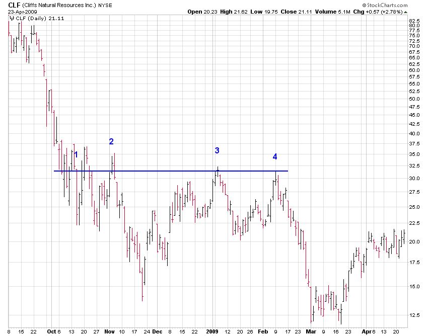
The more often a trendline is tested, the more valid it becomes. Cliff Natural Resources (CLF) shows persistent resistance at $32.50. With four separate challenges of this level over a four-month period, we should expect any future rallies to stall at this price.
If a resistance or support level is associated with increasing volume, the trend becomes more valid. Consider the trading history of Agrium (AGU). In September 2008, $42.50 served as resistance. Each time that price level was tested, volume increases (blue circles). This pattern added weight to the $42.50 level and indicated that overcoming that price point would take significant time.

Bottom line: Support and resistance levels are key mile markers in a stock’s progress. Whenever you’re developing trading strategies, consider these points on the graph. Doing so will help set profit targets and prevent frustration when eventual reversals occur.
Channels
Channels come in three forms: horizontal, ascending, and descending. Descending channels are a basic form of technical analysis spotted commonly in up trends and are considered bullish; alternatively, ascending channels are often spotted in down trends and are most often considered bearish.
When the stock breaks out of the channel, it can make for a strong entry point. The following stock chart of Fastenal (FAST) offers a simple example of a descending channel.

- Here we see how Fastenal (FAST) formed its descending channel over the course of four months. This is considered a large channel.
- The stock broke down and out of the channel on high volume. However, two days later on the volume three times greater than the average, the stock reversed back into the channel. If you would have sold the stock short (bet that the stock was going to fall in price), this would be a signal to cover and exit for a small loss. Strategy aside, this was most likely a news related price swing, and the very next week the broke out of the channel to the upside (above $40 a share).
- Slightly advanced for this post but worth noting, here we can see how the descending channel ended up acting as support at just under $38 a share (resistance becomes support). A secondary buying opportunity, the stock rallied off this support quickly ran back up above $40.
- The stock then claimed higher highs above $44 and broke out of a small base. This signifies the continuation of the uptrend that was initiated back at point “2”.
To be more technical, a channel is the combination of an existing trendline and an additional parallel line. Normally, the share price will oscillate between the trendline and the parallel line, enabling swing traders to create potentially profitable trades.
As long as the price remains range-bound, traders can buy at the lower end of the channel and sell at the higher end. For a deeper understanding of channels and their implications as a beginner, follow these three basic guidelines:
Channel identification Like trendlines, stock chart channels can be upward sloping, downward sloping, or horizontal. Also, we may see all three patterns on one chart. In the chart of the S&P Homebuilders Index (XHB) we have drawn three channels (black—parallel, red—down, and blue—up). The existing trendline is the solid line, and the dashed line represents a parallel channel line. Within this range each channel offered multiple opportunities to profit.

Channel breakouts A move through the channel line indicates the underlying trend is strengthening. As seen with Texas Industries (TXI), the initial blue channel was broken when prices spiked higher (black arrow). This developed a more pronounced uptrend (green line) that has continued to power the stock higher.

Channel trading For very advanced traders, trading within a channel can sometimes lead to greater profits than simply trading with the trend. In this chart, Baidu (BIDU) wasn't in a consistent uptrend since its January low. An investor who correctly called the bottom, bought the shares, and held this position would have a gain of 93%. While this performance is impressive, a swing trader who bought at the lower band (green arrows) and then sold at the upper band (black arrows) would have seen a total profit of 125%.

Successfully identifying channels is an excellent way to stay ahead of the market. Like all technical analysis though, practice and experience are required draw them cleanly. There are many false positives to keep an eye out for.

Daily moving averages
Daily Moving Averages (DMAs) are, alongside volume, the most commonly used technical indicator. In short, a daily moving average is a line added to any stock chart that represents the average price of a stock over the last xx days.
Traders use all sorts of moving averages. The most common is the 50-day moving average, so a rolling line that displays the average price of the past 50 days.
When reading a stock chart, moving averages can act as support or resistance. When a stock is trading around or on this line, it can tell you a lot about the stock's price action and overall trend.
- Support - Let's say we are looking at a company whose stock price has been increasing for some time. The stock has had so many up days that it hasn't touched its 50 day moving average (DMA) for well over three months. Eventually though, the stock starts falling towards its 50 DMA, and one day it finally hits it but immediately bounces back higher in price during the same trading day. What the heck? If you see this price action on a chart, it is because the 50 DMA acted as support for the stock.
- Resistance - If a stock has been trading below its 50 DMA for some time, then starts to trend back upwards, the 50 DMA is often a point of resistance. This is due to its widespread use by investors and traders using it as an opportunity to sell shares for a profit.
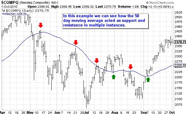
As you start to watch stocks and look at more charts, add a 50 DMA and take note. It is extremely important because whenever a stock trades at or around this line, it can really foretell where the stock is going to go next. Here are two examples:


Stock market trends
All investors understand the wisdom behind trading with the stock market trend. After all, few would drive their car the wrong way down a one-way street, so why try to trade against persistent market movements?
Simple to understand, but questions remain over how to determine when a series of price movements represents a true trend versus a one-off anomaly. By following these four rules, we can ensure that the stock trend is valid:
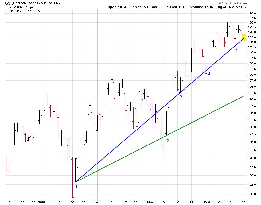
1. At least three data points needed – Only when we have three or more points of contact is a trend considered valid. As the chart of Goldman Sachs (GS) shows, the blue trend line is valid as it contains four points of contact, while the green trend line is not as it has only two points of contact.
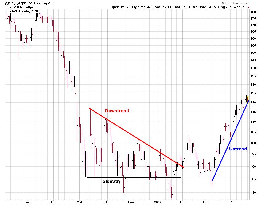
2. Direction – Trends can move in three directions: up, down, and sideways. As the chart of Apple (AAPL) shows, studying prices over long periods of time often allows for the appearance of all three types of trends on the same chart.
3. Watch the slope – The slope of a trend indicates how much the price should move each day. Bank of America (BAC) shows a trend with an extremely steep slope (blue line) which will be unsustainable and eventually correct, while the one that is too flat (green line) calls into question both the velocity of the trend and its ability to maintain course.

4. Time matters – The time measurement used speaks to the validity of a trend. Generally, monthly time series carry greater importance than weekly prices, which supersede daily prices. The longer your observed time horizon, the more significant the weight carried. For example, this downtrend on Sears Holdings (SHLD) gone on for two years. Was this a sign of more damage to come? Today in 2019, Sears Holding stock no longer trades because the company went bankrupt!

Stock market trends are one of the most powerful technical tools we have. Learn how to apply them to your analysis and positive results will follow as you begin predicting stock trends.

Common spots where the market finds support & resistance
When tracking the overall market, knowing the most common support and resistance levels to look for offers a big advantage. Why? Because it allows investors to more accurately gauge and predict future movements while performing their analysis.
Below I break down the top five most common areas where you will see the overall market (most often represented by the S&P 500, NASDAQ, and the Dow Jones Industrial Average) find support or resistance. Learn to spot them and you will be one step closer to performing technical analysis like the pros.
Weekly and monthly highs/lows (horizontal trend lines) The most common identified areas of support or resistance for the overall market are weekly and monthly highs/lows. Because the market is constantly creating new trends, there are always these easily identifiable points on the charts. While not all act as true support or resistance, the ones that do tend to be critical as they can make or break a trend.

50 day moving average The 50 DMA is a line that is formed by taking the average closing price of a stock over the last trailing 50 trading days. When the market is in a steep correction or a prolonged uptrend, this moving average is commonly seen as resistance and support (respectively). Almost all stock chart websites offer the 50 MA as a technical indicator overlay because it is so commonly used by investors.
100 day moving average The 100 DMA is a line that is formed by taking the average closing price of a stock over the last trailing 100 trading days. The 100 MA is not seen as frequently as the 50 simply because it typically draws further away from the trend. When it does come into the picture however it is very often noted.

Fibonacci retracement levels Fibonacci Numbers are slightly more advanced, but in their simplest form make up the key Fibonacci levels: 38%, 50%, and 62%. They are drawn on stock charts by taking the absolute high and low of a move and then determining the appropriate levels in between. Some investors use them religiously while others may only refer to them after larger more notable market swings. Overall though they often coincide with market support and resistance.

200 day moving average The 200 DMA is a line that is formed by taking the average closing price of a stock over the last trailing 200 trading days. This powerful line is not often seen coming in contact with market prices due to its long term calculation. But, when it does come into the picture the market almost always reacts to it as either support and resistance.

Bases and breakouts
As part of my own research, I love going back in time and analyzing major bases and breakouts. A base in a period of time when a stock is trading within a defined price range. Bases can take months and even years to develop. For CANSLIM investors, a six to 12 month base is a good sweet spot to look for.
A breakout occurs when the stock finally moves out of the trading range to the upside on heavy volume. Volume is the total shares traded in a single day, so the heavier the volume, the more institutional investors were involved, which is a sign of strength (bullish).
Sina Corporation’s (SINA) breakout way back in September 2010 serves as a clean example of how to read a stock chart and what to look for.

- After an exhaustion gap in late November 2009, SINA peaks over the next two months then falls into a fresh base in 2010. The base would take over 8 months to form, but its clear support and resistance set the tone for its coming breakout in September 2010.
- SINA sets up a nice handle for its base. Note how volume surged to form the left side, then dropped off again as the formation took place and prices started creeping up. Volume then returned as the stock made its key break through $46.
- Volume surges as SINA moves to fresh all time highs above $48, its next major buy point. Volume on the day was the highest of the 2010 year up to that point which is exactly what CANSLIM investors want to see: a massive accumulation day.
- After several weeks of bouncing in the low $50s, SINA retraces back under $50 and bottoms at $48.50. CANSLIM note: pull backs to the breakout area are very common and should not be feared. In this case SINA stayed $.50 above its original breakout of $48. What gets tricky is when these breakouts fall back under their breakout points. Sometimes this can cause your stop loss order to trigger prematurely.
- SINA forms a follow up base in November 2010 which sets up a secondary buy area between $62 and $63.60. SINA was already up more than 35% from its original breakout at this point.
- After a peak and pull back in early December, volume drops off as SINA forms yet another base. After such a strong run, volume dropping off minimizes any sell pressure and affirms investors are overall satisfied with the stock at its current levels. This leads into an early January breakout through $74 on record volume yet again.
For a more recent example here in 2019, take a look here at Disney's four year base and breakout. What a beauty!

Here's another great example, this one referencing Biogen (BIIB). The base we are focusing on here was a seven month cup with handle base that formed from March through October 2010. Here is a daily chart showing the original base that started an 80%+ move for the stock.
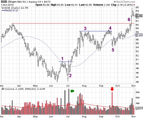
- Biogen (BIIB) begins forming its bottom by snapping out of its long term downtrend on strong accumulation volume. The 50 DMA proved to be too strong of resistance which lead into a retracement back down to $46 to test lows.
- A critical turning point for the stock. $45.96 is not pierced (no lower lows) and the stock gaps on huge volume (2nd highest dating back the last year) to re-test the 50 DMA resistance which is broken several days later. A bottom is officially in for BIIB.
- After a quick 10%+ run-up, BIIB establishes a top at $58.16 which it tests once more before trending back towards its freshly uptrending 50 MA for support. This is the start of the handle of its base.
- The stock breaks $58.16, a technical buy point, but immediately reverses back into its base the next day (a sell signal).
- News causes BIIB to gap to the downside on heavy volume. This is the last shake out of weak investors and the stock spends the next month trending up towards its high at the time of $60.28. Note the lower volume heading into the breakout at point 6.
- Volume jumps on increasing volume as BIIB surges out of its base, buy point $60.40, to claim fresh all-time highs.
And here is a weekly chart showing the original setup, breakout, and price action thereafter. Note the distinct support and resistance. Zooming out can often provide a clearer prospective. Beautiful.

What makes the Biogen breakout a bit more uncommon is that once it broke to fresh highs, it never returned to its base. This is every CANSLIM investor’s dream. Why? It means that there was no risk of any stop loss order getting triggered prematurely.
Ok, one last example for this section. Back in 2010, Fossil (FOSL) was a leader among its retail peers, not only for its great growth but also the appreciation of its stock price. The 350+ store retailer selling accessories and watches went on a massive run since its breakout in August 2010. First, I have a daily chart showing how Fossil’s setup developed over 3.5 months.

- After finding support multiple times at its uptrending 200 DMA, Fossil (FOSL) formed a nice tight flag that lead to the break through $41.20. This was the first technical buy point for the stock.
- FOSL posts positive earnings and gaps through key resistance at $43. Investors should note that the high on this day was $46.30, just $.05 above the stock's all-time record high set way back in December 2007 (see the weekly chart below). The gap range was filled with support found at $43. This is an important distinction as resistance became support, exactly what bulls look for in a pull back. This was the structure for a nice tight horizontal flag that lead to the break at #3.
- Volume returns as FOSL doubles its daily average shares traded and surges to fresh all-time highs above $46.30. This was the proper follow up buy-point for FOSL and was the start of what has turned out to be a fantastic move for the stock.
To see how Fossil has fared since its monster breakout, view the weekly chart below. Take note of the multi-year cup & handle setup that had formed over the last three years. In the 12 months after its breakout in August 2010, Fossil stock ran over 220%.


Gaps
A price gap is created when a stock closes at price X for the day, which is at 4:00 PM EST, then in after-hours or pre-hours trading the following morning is bought or sold down in price. With the buying or selling during this time when the market is technically closed, the stock then opens up at 9:30 AM EST at the new price, and the stock chart shows a literal gap. Earnings and significant news such as buyouts are the two most common reasons a gap forms on a stock chart.
Let's use a chart of Apple (AAPL) as an example. The stock closed at $174.36, then the company reported earnings which they exceeded. As a result, during after-hours trading, investors bought shares in with conviction, driving the stock price up all the way to above $188. So, the next morning at the 9:30 AM EST opening bell, that is where AAPL stock opened in price.

A price gap up or down in price can actually be a determination of the overall direction the stock will move in the coming months. A big price gap on very high volume, which means strong institutional buying of the stock, could mean more higher prices to come.
Here's at look at two oldies but goodies from my research collection. Way back in 2007, both Amazon (AMZN) and Apple (AAPL) had quick powerful runs after gapping higher.
In April 2007, Amazon.com (AMZN) gapped multiple times as it ran over 100% from $42 to a high of $89 three months later. Note the volume explosion on the second gap day, which is a tell-tale sign of significant institutional participation (think hedge funds, mutual funds, endowments, etc).

Apple (AAPL) also gapped higher in April 2017, successfully breaking out of a base and subsequently moved up ~40% over the next three months.

Overall, gaps occur in all different shapes and sizes and can be a means of predicting the price movement of a stock over the next several months. Not all gaps tell the same story though, so it is important to conduct your own research before considering a trade.
Triangles (wedges)
Wedges are a sub-class of bull and bear flags. Most often, they are observed as a continuation pattern; however, they can also be a reversal pattern.
I don't want to go too deep into triangles here since this is more of an introductory guide, but here is an example of a symmetrical triangle (wedge) pattern followed by an ascending channel in a downtrend (bearish continuation pattern).
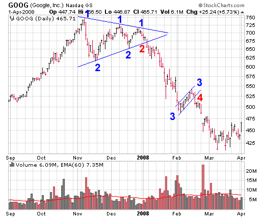
- Google (GOOG) forms the top half of its symmetrical triangle.
- GOOG forms the bottom half of its symmetrical triangle. The red “2” is where the pattern broke and the bears took control of the stock. This would be a great entry point for a short position (a bet that the stock is going to go down in price). As can be seen in the chart, Google dropped from $675 to under $450 (-33%) over the next two months.
- GOOG forms a bear flag, or what we now know as an ascending channel. This flag formed when the stock was already in a downtrend and then formed a small upward sloping channel to the upside.
- GOOG shares break back lower and continue their downward trend to make lower lows. The initial break is the ideal short entry point.
Head and shoulders
Head and shoulders setup is one of the more well-documented patterns. In a classic head and shoulders setup (which is a reversal pattern), a stock in an uptrend creates a high, pulls back, then creates a higher high, sells off down to the previous trading range, rallies back towards previous highs but stops short, then sells off and ultimately crashes through what is known as the "neckline" to much lower lows. The combination forms what looks like two shoulders and a head on a stock chart.
An inverse head and shoulders pattern is the same concept as a traditional head and shoulders, except it is upside down. They are observed far less frequently, but can be just as powerful in signaling a major shift in momentum.
Like triangles (above), I will not go too deep into head and shoulders setups here. However, I have a terrific historical chart example to show using Tiffany's (TIF), which includes not only both head and shoulders setups, but also a wedge!

Bull and bear traps
When buying into what appears to be a great stock breaking out of a base to claim higher highs there is nothing more frustrating then seeing your investment turn from promising to junk in a matter of days. As an investor you thought you had a potential winner on your end, but the stock falls off after the, “breakout”.
Congratulations, you were victimized by a bull trap.
Bull and bear traps alike are commonly seen and can be very hard to avoid. Whether you are a seasoned market veteran or a new trader, dodging these tricky traps is no easy task.
The most common form of a bull trap occurs when a stock breaks higher, most often to several week or several month highs, then almost immediately reverses back into its base and sells off over the next week or longer. It is considered a trap because:
- Algorithmic traders and hedge funds identify the price point where the most automatic stop buy orders are waiting to be triggered.
- Next, they buy up enough shares to push the stock higher just high enough to trigger all the pending buy orders.
- They then sell into the strength to take profits (and potentially go net short thereafter). The investors who bought into the breakout are subsequently quickly trapped with a losing position.
These occurrences are tormenting psychologically and, well, overall they just plain stink. Below are several examples using Amazon (AMZN), Green Mountain Coffee Roasters (GMCR), and Cepheid (CPHD).


Traps are inevitable. As traders, we all see them from time to time. My best advice to minimize the pain is to use proper position sizing. A topic for a different day, but it is unwise to buy a full position at first.
To position size correctly, consider buying say 50% of the shares with your first buy order and the other 50% over a second purchase (or split into two other purchases of 25% each) as the stock continues to moves up in price. By stacking your orders, you lower your initial risk and take on more risk only when you see confirmed strength of the underlying stock.
Three great post-earnings setups
Earnings season can be difficult to navigate for investors that do not understand the game. The examples below are not your normal "last week" type stocks. I went all the way back to 2006 to find great examples of setups that work time and time again. Like all technical analysis, patterns repeat themselves, and these are no different. During ever earnings season gems like these stocks below will appear and with a little practice your portfolio will be ready to capitalize on their future success.
Netflix (NFLX) February 2010: Descending channel After Netflix gapped to fresh highs, the stock consolidated and formed a nice channel that presented a fantastic buypoint at $62. This was the start of a huge run that has lead Netflix all the way up to $248 in 2011, or over 400%.

Apple (AAPL) April 2007: Bull flag Bull flags come in many shapes and forms. While this Apple setup could be considered a simple horizontal consolidation, the setup is very clear to identify. After posting earnings price volatility drops alongside volume as the stock trends sideways. Institutional buyers then return and push the stock to fresh highs, which is also the buypoint. In Apple’s case the stock hit its buypoint of $102.60 on 5/7/07 which was the start of a multi-year uptrend.

Intercontinental Exchange (ICE) September 2006: Multi-week base What makes this chart so compelling is its simplicity. After posting earnings and surging into the $70s, ICE pulled back and formed a basic two week base with a buypoint of $88. The stock did not trade back into its gap range and proceeded to break out through $88 on increased volume. ICE eventually peaked at $194.92 on 12/26/2007 which allowed investors to capitalize on a 150% return in just over a year.


-
What are meme stocks
9 months ago
-
download stock trading for beginners
2 years ago
-
Who Invented the Stock Market?
2 years ago
-
Stock Trading Terms Every Trader Needs to Know
2 years ago
-
WORLD’S GREATEST STOCK TRADER by by Richard Smitten
2 years ago